Showing posts with label dsdn111. Show all posts

Thursday, 14 June 2012

The Joint

I refrained from making a reference to 'passing the joint' in the title so instead you get a big dollop of political-correctness. What started off as a bunch of messy sketches and card is now a solid abstracted form of the neck/head. Enjoy.


Such sketches were making me consider taking up engineering.


Here are some conceptual models and a cheeky mock-up. The foam gets everywhere.


And, at last, the final. I really must thank Francis for putting up with my incompetence in the workshop. In the end, having made a count of mistakes, I abandoned the wood I'd bought for a piece of scrap timber I found in the waste bin. As they say; one man's junk is another man's abstraction. The drawing (or "the vellum" as it was referred to affectionately in my organiser for the past five weeks) is entirely pencil built up on pencil and I still don't know what sort of lead an 'F' is...

Thursday, 17 May 2012

Head! Shoulders, Knees and DSDN! (111!)

Having received the head/neck joint as a precedent for my 171 model I researched into the way the spine is constructed and its connection to the skull.
Link to image

Link to image

Link to image
The first image shows the top of the spine and the distinction between bone and cartilage (the cartilage being red). The second shows the alignment of the vertebrae that make up the spine and the connection it makes with the skull. The third shows the individual parts to the vertebrae. The type of motion created by the neck is very diverse but it is the result of the collaborating minimal movements of the vertebrae. The small changes in orientation have a larger overall effect the more pieces come into play.
Link to image
Linkage, in the mechanical sense, is the connection between two points. The link provides a guide for optimum movement as it has a constant length. This stops whatever it is linked to from straying from a set path of motion.
Link to image
Juxtaposition is the comparison of two things, abstract or literal, by placing them next to one another visually. Often the two aspects will be highly contrasting, the juxtaposition emphasising this contrast to make it easier to notice.
Link to image
Rotation is movement about a central point or axis. With this illusion the polygons appear to rotate around the black dot when it is focussed on and the image is moved in and out. Rotation is a key movement of the neck and head. Although no bones are directly pivoting upon each other the overall effect is the the head can rotate atop the neck to look around.
Link to image
Force, in a non-scientific design sense, is how much weight or pressure something is experiencing. The tension of a taut wire shows force in the object. A solid mass or counterweight shows force. Luke Skywalker shows force.
Link to image
Time is an element that goes hand-in-hand with movement. Time shows movement. Movement shows time. It adds an extra dimension to any object that can hold it as it allows people involved with it to see its progression and, in a sense, brings it to life.

Thursday, 10 May 2012

Curatorial


“The beauty of flames lies in their strange play, beyond all proportion and harmony. Their diaphanous flare symbolizes at once grace and tragedy, innocence and despair, sadness and voluptuousness.”
 (E. M. Cioran, n.d.)
Fluidity, Juxtaposition and Fire; these are the components of the form you see before you. Fluidity, as the ability to alter form without disruption, is captured beautifully by E. Babled’s Quark plexiglass coffee table (shown above). This, along with other pieces of Babled’s work, inspired me to seek out what materials hold fluidity and which it comes naturally to. Metal, glass, and wax all have the potential to hold fluid forms, all of which are birthed from one source; fire. Fire plays with purely natural and elegant fluidity in every moment that it exists. Within my model are my attempts to control this fluidity by combining it with my secondary precedent of juxtaposition.
Inspired by the Arts and Crafts movement, my model was developed from a simplified representation of flame, however I found across practically all the styles I’ve studied the reoccurring concept that nature seems to underlie all good design. I wanted to employ juxtaposition as a form of control. For every curve there is a straight line, for every solid plane there is empty space. Although the lines of comparison are not as clear as they are in my precedent image, they are positioned within my model to create balance. I tried to incorporate William Morris’ belief of honesty in construction by using wax over any other sheet material as it links to the process of which I developed my model.


References:
Emil M. Cioran quotes (n.d.) Thinkexist.com. Retrieved from http://thinkexist.com/quotation/the_beauty_of_flames_lies_in_their_strange_play/345809.html
Images found at;
Quark Plexiglass (2009). Emmanuel Babled Studio. Retrieved from
http://www.babled.net/en/limited-edition/17/Quark-plexiglass.html
Juxtaposition Art (n.d.). Pic 2 Fly. Retrieved from http://www.pic2fly.com/Juxtaposition+Art.html

Wednesday, 9 May 2012

Sketchy Models

Sketch models. Sketch models everywhere.


This next set of photos is of my final draft (if there is such a thing as a final draft) model, playing with honeycomb wax, before I attempt my final. Melted candle wax was too unruly to create sheet forms on the model so I tried honeycomb as it was still wax, maintaining the connection to flame (however progressing from it), which had this superb hexagonal pattern that contrasted with the curved form of my model. It may be that my final closely resembles this but is just better crafted.


Monday, 7 May 2012

Philosophy for the Terminally Happy

After a fair bit of searching and filtering I finally came across a man called Emil Cioran. The quote of his that caught my attention was his wonderful description of fire:
 “The beauty of flames lies in their strange play, beyond all proportion and harmony. Their diaphanous flare symbolizes at once grace and tragedy, innocence and despair, sadness and voluptuousness."
The full quote can be found here, but just a warning; his stuff gets pretty heavy. I found myself in a state of mild pessimistic self-contemplation after reading more of his work. So I cheered myself up by drawing some pictures of gorillas. (That may or may not be explained in a later post)

Friday, 4 May 2012

Pyromania

Here are my sketch models for Project 2. I tried to convey the fluidity of fire in these models, the first being a candle flame, the later ones being more of a representation of larger flame. Yay fire!


I found the wax to be relatively easy to carve which gave me an idea on how to bring out juxtaposition in an alternate way; through the comparison of the internal wire structure and the out wax shell. Also through the difference of the organised curves of the wire and the uncontrolled form of the wax.


Monday, 30 April 2012

Compulsion to Blog Episode 10

I am keen to experiment with wax as a material for my model because melted wax holds such interesting, fluid forms. I researched some art done with wax and came across these awesome examples;
http://fineartamerica.com/featured/1-melting-wax-katina-cote.html

http://www.ettestudios.com/2011/07/inspiration-of-day-rainbow-of-melting.html
http://www.craftster.org/forum/index.php?action=profile;u=117235;sa=showTopics
Looking at Babled's work got me think a lot about the ability of glass and water to portray fluidity but after thinking of glass and wax and how they get their shapes I realised how well fire does this also. I want to try and capture the form of fire in my model, using wax in some way to emphasise its fluidity.
http://freeimagesarchive.com/img-flame-683.htm

http://www.fire-sprinkler.co.nz/
My inner pyromaniac is squealing with joy...

Friday, 30 March 2012

Compulsion to Blog Episode 04

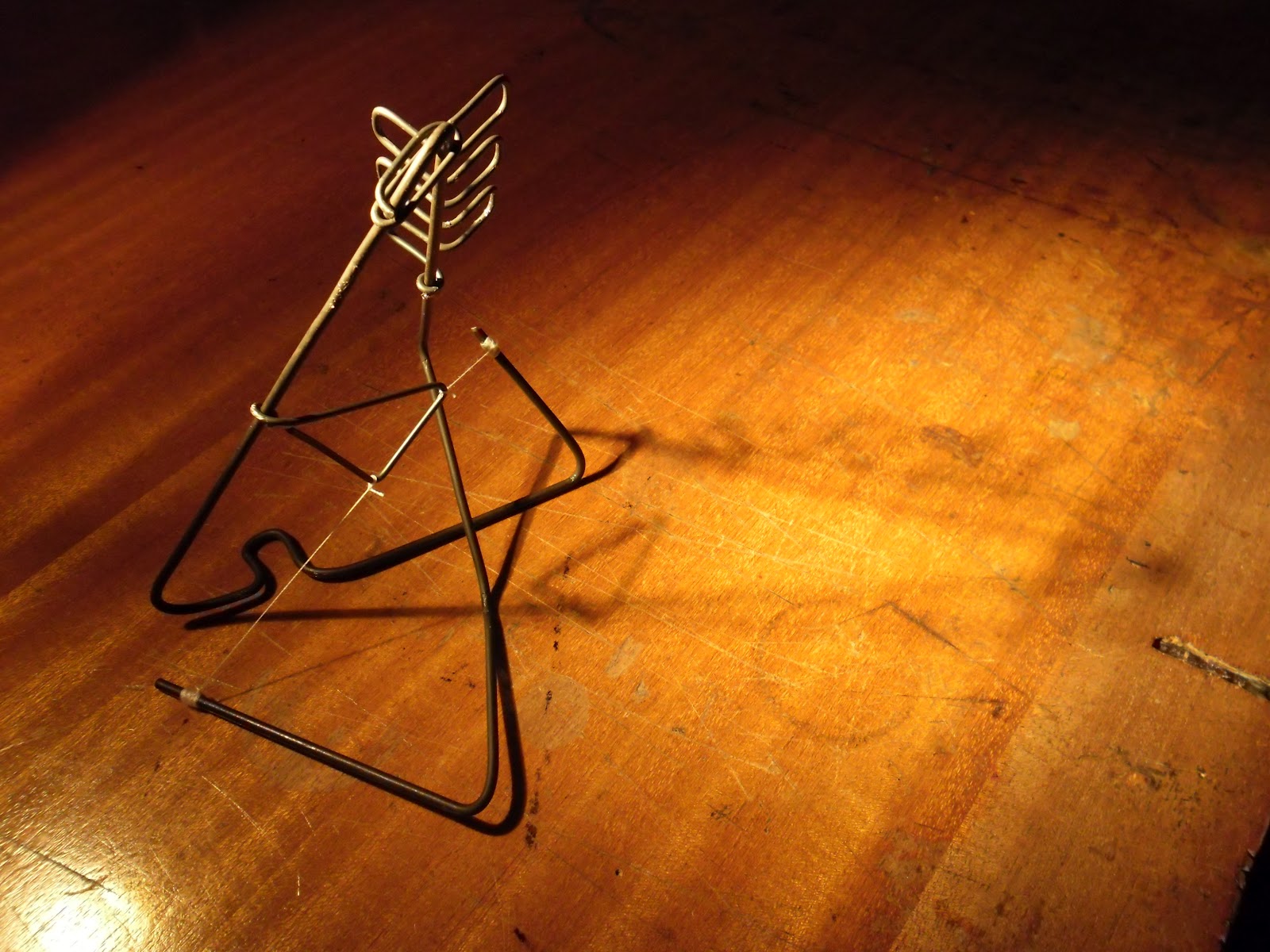
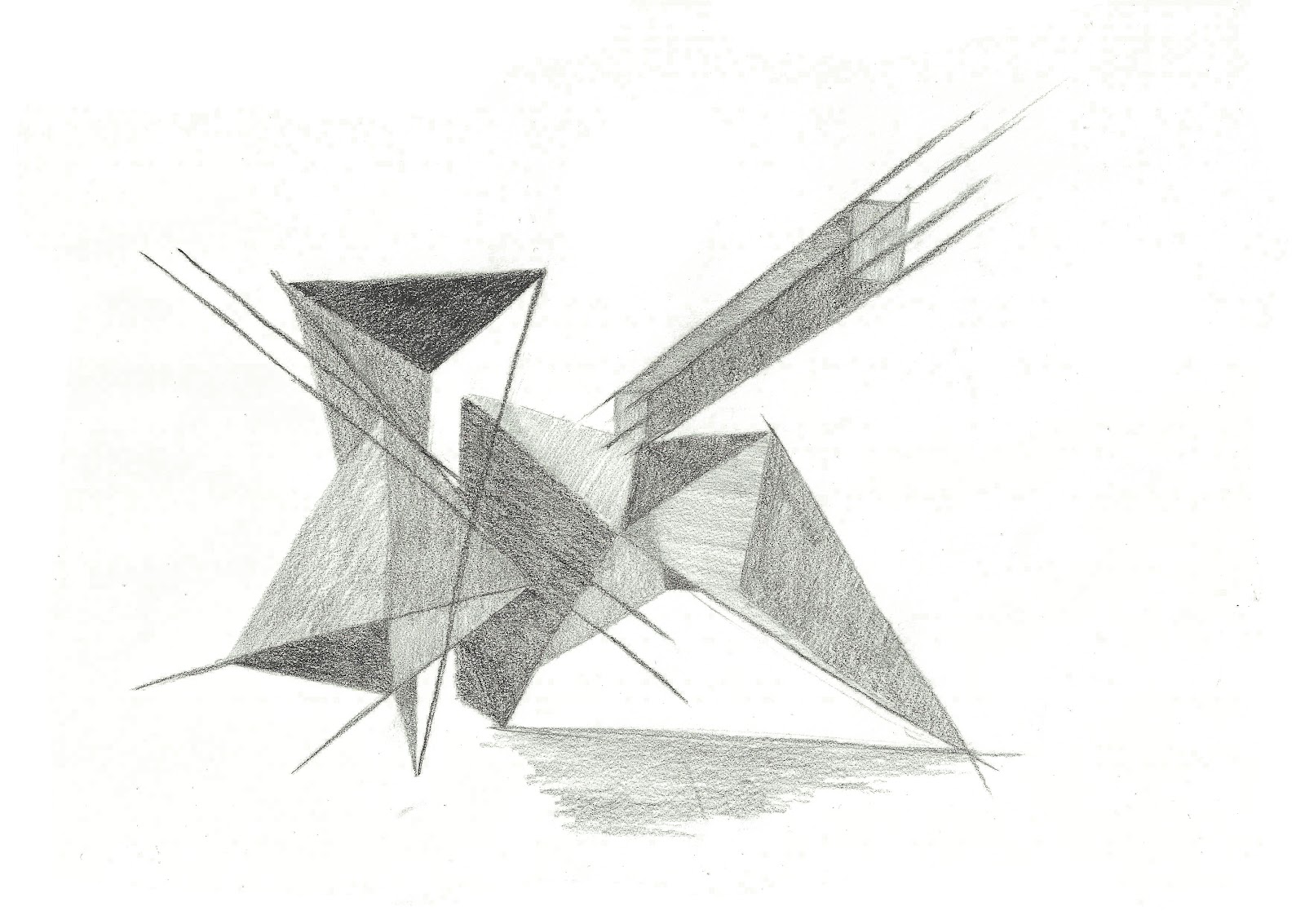
And here are my final works. I apologise that I went a little overboard with the photos but I wanted to show aspects of shadow and form for both and one 2D photo can only achieve so much.
1.5 mm Card


Wire


I am an organised person. I like order, and for that reason I found contrast the most exciting principle to express in this project. Creating something completely asymmetrical was unfamiliar to me, much like sculpture work in general, so I took it as an opportunity to be adventurous.