Thursday 31 May 2012

Locovisual

Underground Arts Tattoo Studio
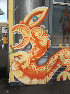
Underground Arts Tattoo Studio is a striking example of Postmodernism. As said by Charles Jencks in his edited book The Post-modern Reader; “post-modernism means the end of a single world view and… a resistance to single explanations, a respect for difference and a celebration of the regional, local and particular” (1992), something which Underground Arts displays through the collection of cultural references and styles that make up its design.
The actual architecture of the building is most closely associated with the Art Deco movement in its rigid geometric structure. The edges are softened by the occasional curve and the base colour of the building is Deco beige. The design becomes more “hybrid, mixed and ambiguous” (Jencks, 1992) with the addition of painted on columns. These illusionistic columns fail to serve any purpose that they would on other buildings as they do not provide any real support and the choice to paint the grey instead of white removes any connection to the pure white marble of classicism. The real irony is in the connections the columns provide to classicism as a promotion of democracy, and the affiliations “the modern man who tattoos himself [being] a criminal or degenerate” (A. Loos, 1910).

The bright orange taniwha with the ancient Maori tattoo pick and the Chinese dragon with the modern needle meet at the corner of the building to finalise this post-modern clash of cultures and complete the “erosion of the older distinction between high culture and so-called mass or popular culture" (F. Jameson, 1991).
This style suits the shop as the art of tattooing has always been considered just that; an art. It is recognised and practised across many cultures and the cultural collage that is presented by Underground Arts represents the building and business superbly.


References:
Jencks, C., (1992). The Post-modern Reader. London: Academy Editions.
Adolf Loos, Ornament and Crime, excerpted in Gorman, C. (2003). The Industrial Design Reader (pp. 74 - 81). New York: Allworth Press.
Jameson, F., (1991). Post-modernism and Consumer Society, Athenaeum Library of Philosophy. Retrieved from

Sunny With a Chance of Techno

I was searching soundcloud.com for potential background music for my clip and came across a number of tunes I would consider using. I am still tossing up whether or not to use a more futuristic/techno style piece or to go with a more subtle acoustic one.

This one, as cool as it is, is a bit intense for what I want but the electronic style is similar to what I'm looking for.
http://soundcloud.com/noisia/noisia-alpha-centauri
Something a bit more like the later half of this is more like it;
http://soundcloud.com/forekast/ludovico
As far as acoustic ones go the first is probably my favourite for subtlety but the second is more lively. I would have to check both against my clip to see which suits best and within that find which 30 - 40 seconds are best.
http://soundcloud.com/philipraivander/background-music
http://soundcloud.com/philipraivander/background-music-2

Wednesday 30 May 2012

Got Any More Audio?

Statement:
For the second group work task for the project The Clip, we further explored the company we previously advertised in poster form, Milk Audio by creating a  filmed 15 second advertisement.
The intention of our 15 second advertisement was to show the various operations that the company Milk Audio does, including sound effect for video gaming, production of film soundtracks, and also music production. We used the branding material that we created in the first group work task at the end to show a continuity of branding within Milk Audio, with this displaying the company name and slogan. The demographic that the advertisement was aimed towards was people within the fields that we mentioned in the 15 second clip such as game and film producers, and musicians.
Initially we had planned on adding the more humorous element of having milk mustaches on the actors which we would generate on Adobe After Effects, yet due to a lack of familiarity with the software programs we were using and time constraints, we were unable to add this element, however we are happy that the advertisement we have created is of a good standard and brands the company well.
The Team

Group team members: Scott Brebner (scottbrebner.blogspot.co.nz), Hannah Kemsley (hannahkemsleydesign.tumblr.com), Vincent Than (thanarang.blogspot.co.nz)

Saturday 26 May 2012

I'm Out of Storyboard Related Puns

Here is my pencil draft of getting ideas on paper. My sentence in studio to portray my ideas was "a new way of seeing the world and the worlds within it" but I am thinking of ways to reword it to make it more engaging.

The dual storyboards is so the movements and transitions and such can be clearly displayed on the annotated one and the coloured one is to provide an unobstructed view of the frames. Enjoy.

Monday 21 May 2012

Testing, One, Two...

Having a play with stop-motion animation on a sunny Sunday morning. I found my focus jumped around this too much. I wasn't sure if I was supposed to be looking at the apple or Brigid holding it. Perhaps a slower frame rate would allow more time for viewers to get their bearings or less movement overall. The one difficulty with this is is that people cannot hold perfectly still and holding the same pose for a long time gets tiring so I'll have to be cautious with how I get people to pose.
This is the style in which I want to produce my frames. With the individual components stuck on in layers it means I can animate particular aspects at different rate, whether I want something to be smoother or freezeframe etc. It depends on whether or not I can get access to a greenscreen or something similar because constructing each frame on photoshop gets less and less appealing the more I think about it. But I do like this style. Sometimes you do stuff just because it looks cool :) Thanks to Brigid Quirke for being a patient model.

Thursday 17 May 2012

Head! Shoulders, Knees and DSDN! (111!)

Having received the head/neck joint as a precedent for my 171 model I researched into the way the spine is constructed and its connection to the skull.
Link to image

Link to image

Link to image
The first image shows the top of the spine and the distinction between bone and cartilage (the cartilage being red). The second shows the alignment of the vertebrae that make up the spine and the connection it makes with the skull. The third shows the individual parts to the vertebrae. The type of motion created by the neck is very diverse but it is the result of the collaborating minimal movements of the vertebrae. The small changes in orientation have a larger overall effect the more pieces come into play.
Link to image
Linkage, in the mechanical sense, is the connection between two points. The link provides a guide for optimum movement as it has a constant length. This stops whatever it is linked to from straying from a set path of motion.
Link to image
Juxtaposition is the comparison of two things, abstract or literal, by placing them next to one another visually. Often the two aspects will be highly contrasting, the juxtaposition emphasising this contrast to make it easier to notice.
Link to image
Rotation is movement about a central point or axis. With this illusion the polygons appear to rotate around the black dot when it is focussed on and the image is moved in and out. Rotation is a key movement of the neck and head. Although no bones are directly pivoting upon each other the overall effect is the the head can rotate atop the neck to look around.
Link to image
Force, in a non-scientific design sense, is how much weight or pressure something is experiencing. The tension of a taut wire shows force in the object. A solid mass or counterweight shows force. Luke Skywalker shows force.
Link to image
Time is an element that goes hand-in-hand with movement. Time shows movement. Movement shows time. It adds an extra dimension to any object that can hold it as it allows people involved with it to see its progression and, in a sense, brings it to life.

Wednesday 16 May 2012

The Vision

What is Media Design all about? Alex, Brianna and I boiled it down to something that looks a little like this;
Without technology we wouldn't have media, and without media there is no way anybody could design for it, making media design pretty redundant. Media provides us many things; perspective, connection and, what we saw as the primary aspect, entertainment. It comes in many forms from many sources.
I want to apply my skills in my discipline to the development of games and film so I focussed on what it is that makes games and movies  entertaining. One key element I found in both of them (although far more necessary in movies) is a good narrative or story. A good story is what makes a film memorable and can make a good game great. I want my stop motion clip to show media design to be a doorway to a new way of seeing and tell it through an engaging, however short, story.

Surfing the Web on My Storyboard

I'm going to go ahead and apologise for the title now...
Link to image
What I like about this segment of storyboard is it doesn't just show what happens next but analyses the jumps between frames, showing development and process of thought. A storyboard needs to show more than just a sequence of images so annotations are key.
Link to image

Link to image
Now I know comics and manga aren't technically storyboards but they hold the same format and one thing about comics is that they put a lot of thought into things like camera angles from which the action is viewed. Even without animation they are visually entertaining.

Monday 14 May 2012

Yeah, it's going to be hard to beat...

Wow. I had been planning on using post-its before I saw this but now I'm a bit intimidated. And then I saw this and I almost cried out of admiration;
Incredibly clever work. It's got me thinking of ways I can use ordinary things in alternative ways, such as the environment shown here;
This next video was shown to me by a friend of mine. I love the use of collage to set up the scene;


Videos found at:
Post-its - http://www.youtube.com/watch?v=-ZtxHOfmhH4
Bad Apple - http://www.youtube.com/watch?v=240Vq6tIxio
Gulp - http://www.youtube.com/watch?v=ieN2vhslTTU
Jimmy - http://www.youtube.com/watch?v=lnbl94GZ6TM&ob=av2e

Thursday 10 May 2012

Curatorial


“The beauty of flames lies in their strange play, beyond all proportion and harmony. Their diaphanous flare symbolizes at once grace and tragedy, innocence and despair, sadness and voluptuousness.”
 (E. M. Cioran, n.d.)
Fluidity, Juxtaposition and Fire; these are the components of the form you see before you. Fluidity, as the ability to alter form without disruption, is captured beautifully by E. Babled’s Quark plexiglass coffee table (shown above). This, along with other pieces of Babled’s work, inspired me to seek out what materials hold fluidity and which it comes naturally to. Metal, glass, and wax all have the potential to hold fluid forms, all of which are birthed from one source; fire. Fire plays with purely natural and elegant fluidity in every moment that it exists. Within my model are my attempts to control this fluidity by combining it with my secondary precedent of juxtaposition.
Inspired by the Arts and Crafts movement, my model was developed from a simplified representation of flame, however I found across practically all the styles I’ve studied the reoccurring concept that nature seems to underlie all good design. I wanted to employ juxtaposition as a form of control. For every curve there is a straight line, for every solid plane there is empty space. Although the lines of comparison are not as clear as they are in my precedent image, they are positioned within my model to create balance. I tried to incorporate William Morris’ belief of honesty in construction by using wax over any other sheet material as it links to the process of which I developed my model.


References:
Emil M. Cioran quotes (n.d.) Thinkexist.com. Retrieved from http://thinkexist.com/quotation/the_beauty_of_flames_lies_in_their_strange_play/345809.html
Images found at;
Quark Plexiglass (2009). Emmanuel Babled Studio. Retrieved from
http://www.babled.net/en/limited-edition/17/Quark-plexiglass.html
Juxtaposition Art (n.d.). Pic 2 Fly. Retrieved from http://www.pic2fly.com/Juxtaposition+Art.html

Got Audio?

Company: Milk Audio
Slogan: Got audio?
Company Bio: We cater for all your sound production needs, be it films, games, or a simple song over breakfast.
Demographic audience: Musicians, sound companies, music companies, gaming companies, 18+ age range.
Group team members: Hannah Kemsley (hannahkemsleydesign.tumblr.com), Scott Brebner (scottbrebner.blogspot.co.nz), Vincent Than (thanarang.blogspot.co.nz).

Wednesday 9 May 2012

Sketchy Models

Sketch models. Sketch models everywhere.


This next set of photos is of my final draft (if there is such a thing as a final draft) model, playing with honeycomb wax, before I attempt my final. Melted candle wax was too unruly to create sheet forms on the model so I tried honeycomb as it was still wax, maintaining the connection to flame (however progressing from it), which had this superb hexagonal pattern that contrasted with the curved form of my model. It may be that my final closely resembles this but is just better crafted.


Monday 7 May 2012

Philosophy for the Terminally Happy

After a fair bit of searching and filtering I finally came across a man called Emil Cioran. The quote of his that caught my attention was his wonderful description of fire:
 “The beauty of flames lies in their strange play, beyond all proportion and harmony. Their diaphanous flare symbolizes at once grace and tragedy, innocence and despair, sadness and voluptuousness."
The full quote can be found here, but just a warning; his stuff gets pretty heavy. I found myself in a state of mild pessimistic self-contemplation after reading more of his work. So I cheered myself up by drawing some pictures of gorillas. (That may or may not be explained in a later post)

Sunday 6 May 2012

Friday 4 May 2012

Pyromania

Here are my sketch models for Project 2. I tried to convey the fluidity of fire in these models, the first being a candle flame, the later ones being more of a representation of larger flame. Yay fire!


I found the wax to be relatively easy to carve which gave me an idea on how to bring out juxtaposition in an alternate way; through the comparison of the internal wire structure and the out wax shell. Also through the difference of the organised curves of the wire and the uncontrolled form of the wax.


Thursday 3 May 2012

Home Stretch

One Word Film as depicted in my storyboard. I want to extend it by having the camera switch to a blank screen part way through on which letters begin to float by and "evaporate" fades on screen then off. If you were to look at all the motion tween paths together it looks like something a preschooler would bring home... or modern art, depends what you're into.

Boiling water audio found at http://www.freesound.org/people/RutgerMuller/sounds/50767/