Saturday 29 September 2012

Shopping For Screens

I finally finished the menu screens for my interface and I'm pretty happy with the consistent style. Here are the images in a vague order;
Main Menu

Navigate Menu

Navigational Point of View

Personal Timetable

Options Menu

2D Map

3D Map
All these will have a different list of Keywords to each other which can be called upon for different effects. For the sake of the Flash interface they will active buttons although their aesthetics won't change. I like the small range of colour because if there are only a couple of colours the eye has to remember that are attributed to the menus the less chance they have of blending into the background and becoming invisible. For the maps the level of detail would change with the zoom as well as whether or not the user is inside a building.

Friday 28 September 2012

DSDN 142 Interim Submission

Today's interim gave me the opportunity to present my work to the class as well as my Tutor and Angela at the same time and receive feedback. What my submission contained was a display of my Fireworks code, the incomplete Fireflies code that used 'jars' and my most recent adaptation of the Firefly code. My goals are to have an interactive environment that has a collection of Fireflies whose behaviour is influenced by the presence of the mouse. As shown in earlier posts, my inspiration came firstly from fireworks then I moved onto fireflies. My code doesn't fully represent fireflies however, as they do not emit a constant glow. In truth they are a type of beetle and only release brief burst of light where my fireflies are like glowing flies.
They functions are that when the big bug (cursor) moves close to the other flies they are repelled by it. By holding the left mouse we can increase the radius of repulsion. The right mouse, although incomplete at the point of submission, was meant to call out to the fireflies, causing them to orbit the cursor.
The code I needed to fix was covered by this storyboard I submitted;
Based on feedback my direction needs to change. I still need to fix the square repulsion issue but the second button function is just that; a button. It is control, not interaction. Do this, get that. Instead I need something that pay attention to the way the user uses the mouse. During the presentation I kept referring to the big bug as "Mama Firefly" but the other fireflies behaviour towards it contradicted its title. Steven suggested that it's more likely that they would try and cling to her like needy children rather than fleeing. I fear this would bring my code too close to the interaction a classmate is doing for 'catching stars'. Angela got more of a predatory impression of the big bug, which is the direction I am thinking of taking it in. A good start would be to give it a more aggressive colour tone (RED!) and maybe have it eat the smaller fireflies it manages to catch. The adjustable repulsion can be replaced with a set value that maybe increases as the predator eats more and more fireflies? The mood of the environment could change too. Perhaps a visible background could darken with the death of each firefly and the colours get more blue as the predator gets redder. Lots to do...

Tuesday 25 September 2012

The Ol' Switcheroo

Looks like I'm switching to another idea. This is good though; it means progress. My jar/firefly program was having a glitch-fit each time the mouse was clicked several times repeatedly, which is roughly the third or fourth thing an inquisitive user will try. This created some funky patterns but overall was unacceptable.
After talking to Angela we decided that the most interesting and 'realistic' aspect of my code was the behaviour of the firefly objects. The way the jars were presented didn't make much sense so I'm swallowing my pride and ditching the jars entirely.
My new direction is to have the cursor replaced by a giant firefly that can spawn smaller ones from it. The way the user moves the 'Mama', combined with clicks, influences the other fireflies behaviour. We'll see where this one goes...

Monday 24 September 2012

Walking Forward

Now that the interim presentation has passed it is time to start producing some computer generated interface screens for my flash (ahoy!) presentation. Here are a couple I managed to complete in the studio (The font is yet to be finalised);

Now it's just a matter of cranking out the remaining ones I want to how in my flash animation.

Saturday 22 September 2012

Fireflies

As adorable as this video is it's only really the last couple of minutes I'm interested in as it gets dark enough that you can see the fireflies clearly. 
One thing that I didn't realise is that their glow isn't consistent and is more of a brief flash than anything. I think for the sake of my program I will keep the glow a constant thing so that users can see the fireflies flying around the screen. If it were just a simple flash then a large portion of the program would be missing.

Their bizarre bodily function results in something truly beautiful :)

Friday 21 September 2012

A New Direction to Success... Hopefully

My new take on my fireworks code is to be about spawning fireflies. The interaction is when the user clicks on the screen a 'jar' begins to grow for as long as the mouse is held down. As it grows it begins to become more red and the tension builds inside it, causing it to vibrate. When this tension gets too great or the mouse is released the jar holds for a moment then bursts.

While the jar grows it spawns fireflies that at this point in time merely fall to the ground but once I figure out how will orbit the mouse as long as it is held down. Once the mouse is released the fireflies are free to roam as they please.

At the moment there is a problem with the fireflies in that to get them to work it requires a pair of nested 'for' loops that slows the program right down (as it's trying to run the jars as well), visible in the picture above with the unwanted trails behind the falling fireflies. I'll need to look into this to get it to run as smoothly as possible.

DSDN 112 Interim

This bombardment of imagery are the paper prototypes of how my interface will take form visually. The outer ring merely represents the edge of the user's vision through the peep-hole. Anything shaded will still be transparent but there it will have a denser tint of colour. One thing I realised after the interim presentations was that I'd forgotten to put a form of highlighting around the key words. In the digital interface they would most likely come up with a brighter outline, a white border or be more opaque.


This is a better representation of how it might actually look. While there is the option for users to customise the colour scheme to make it easier/more favourable to view. This display has every option active apart from the default Arrows and the Time of Day.
 And for the sake of convenience, here is my wireframe once again.

Tuesday 18 September 2012

Explosions, Puppetry and Ripples

Before class today I worked on my fireworks program a bit more and managed to create a randomly coloured firework blast that originated where the mouse was clicked with the right button.


While the effect of this was entertaining, it was quick to understand and was limited to having only one explosion on-screen at any time, any new click overriding the old one. It didn't take long lose interest in this aspect of the program but overall it added to the diversity within it, especially since the sparkler could be run at the same time. This showed me a point that was brought up in class; while simple effects are easy to lose interest in on their own, when they are combined with others it generates a whole new field for users to explore. A way I would take this further if I chose to would be to make an explosion influence the direction the sparks move in by pushing them away from the explosion's centre.
During the actual tutorial we ran an exercise that required us to pair off and develop a person to person interface. My partner Ben and I based ours on puppetry; the way the user moved affected the 'puppet' in different ways. Some people used gestures to measure the strength or level of output. Others made their input verbal; different words having different effects. In this exercise we had a look at what ones were entertaining for the longest and how one input could lead to multiple effects or multiple inputs to one effect. The most interesting interactions were the one that had multiple inputs with interwoven effects so the user had more to explore.
This inspired a new take on my current 142 project that would still use the spark physics I've developed but in a new way. I have yet to figure how to code this but it's on its way, as is a storyboard to explain my new idea. As for right now here is a cool way of indicating where the mouse was last clicked that I developed;


Yay.

Monday 17 September 2012

Technological Refinements

Having discussed my project in further detail with Cornelia I came to the conclusion that the Peep-hole would be physically comprised of an earpiece, a contact lens and a single ring. With the introduction of the contact lens the second ring became redundant as the holographic imagery would be projected by the lens, not between the rings. The purpose of the ring is now to act as a wireless trigger to activate the lens as it would emit the magnetic field necessary for the wireless power. This would maintain the novelty action of the 'peep-hole' but no longer limits users to that particular motion. It's also a lot easier to find a singular ring that fits, opposed to an index and thumb ring that do.
I did some designs for menu layouts for the upcoming interim submission and found a cool motif that I could incorporate into the general design;
Considering the peep-hole is a heavily visual interface I like the idea that menu screens would subtly resemble eyes. They would be centred around a 'pupil', the tabs of the menu being the 'iris'. When shifting between menus a line of light would swipe down the screen and erase the current menu, then swipe the other way to reveal the new menu, effectively 'blinking' between menus.

Friday 14 September 2012

Looking Into Things Further

This sketch is primarily stuff we already know, the main point of interest is the small list of service icons that could feature when the service mode is on. In the studio discussion we talked about developments on the technological side of the Peep-hole. One suggestion was that instead of the ring projecting a hologram in the air they are merely a trigger for a contact lens the user wears that has a screen in it that projects the data directly onto the user's vision. Although this could be summoned by an audio trigger without too much difficulty, making the rings redundant, it removes the novelty of the action that activates the Peep-hole. Also, some people may not like having to wear a contact lens.
The technology that already exists is impressive and it could be developed in such a way that this could very well be possible, especially considering number 7 and 5 in this video;
Watching this definitely raises my faith in our abilities as a species.
This is the lens that would allow us to see an augmented reality. The full article is here; http://www.gizmag.com/electronic-contact-lens-promises-bionic-capabilities-for-everyone/8689/
It may still be in the prototyping phase but there is a lot of promise. Looking through this lens would allow us to view the world with the virtual data posted on top of it. An article on augmented reality can be found here; http://en.wikipedia.org/wiki/Augmented_reality
Yes it's a wikipedia article but at least they draw their information from viable sources. The idea of augmented reality has been around for a while so this peep-hole idea is nothing too difficult to accomplish, as there is likely more than one way around it.


Hopefully there's a way of doing it without looking like a dork...

Child's Play

While playing with this processing application felt like being a child again, writing the code had the opposite effect. It's simple and easy to learn and won't hold a person's attention for too long but it's more the discovery of the effect that I'm pleased with. I can customise it to a fair degree so it is likely that if I stay on my current path I will end up using it or something like it in my final application.


 There were several directions this particular piece of code could go. One was that when the mouse is released all the sparks chase down the cursor and detonate if they touch it. Another could be that these are actually fireflies that buzz around when 'released' by the mouse and behave relative to what the mouse is doing I'll put some study into their behaviour as well as seeing what else I can accomplish with variants of this code.

Thursday 13 September 2012

The Plan

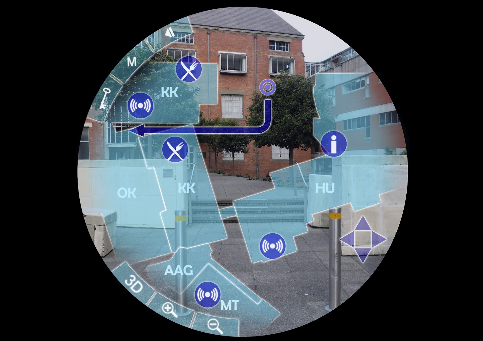
Just because it's not due doesn't mean it can't be finished early. Here is a kick*** wire-frame that shows the various functions of my navigational interface. I ran with the peep-hole idea because of how convenient it is to get what you want just by raising your hand to your face, no fumbling around in pockets or scrolling through lists of other applications and most importantly no cybernetic surgery. Because of this anything that would have been a button needs to have a keyword that triggers it, therefore anything bordered by dark blue. The permanent keywords are ones that are forever accessible, regardless of user depth within the interface. All others are only active within the menu (or sub-menu, whatever you want to call them) they are an option for. Blue situation keywords are either keywords set by the user or a fraction of a phrase that has more than one effect e.g. "Zoom 20%" the % value is how close the user wants to zoom to.
Navigate, Timetable, Options and Store are the four primary fields within the interface and can be access from any of the other fields when their keyword is spoken, as long as one of the field's sub-menus (indicated by the blue boxes surrounding them, e.g. 'Add new' and 'Details' are the sub-menus of Timetable) has not been selected. In the 'Display Controls' segment all the options, excluding 'Colour', the options are all on/off functions, saying their keyword activating/deactivating them.
The 'Avatar' function would replace remove directional arrows from the screen and instead a holographic character, the default being a green faceless man inspired by the green man crossing symbol, who leads the user forward and talks to them. This would make the travelling more entertaining. As it is unlikely that users would want to walk around with their fingers around their eyes the avatar would have a signal, the default being a whistle, that sounds whenever a corner or alternate route is coming up, indicating the user should check through their peep-hole.
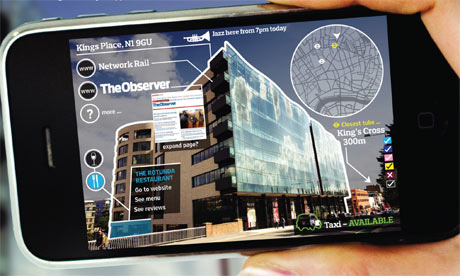
The Peep-hole, as its commercial title shall be from now on considering that's what I keep referring to it as, would be sold as a pair of rings and an earpiece. This would come with the navigational software (as that's what it was originally designed for) but other software would be available for purchase. These programs would include numerous other applications for everyday tasks; personal organisers, banking, socialising (other Peep-hole users could give of visual signals to their location/status/etc.) and so on and so forth, whatever the demand is for. Other, more playful programs would include ones that alter the environment in the alternate cyber world the Peep-hole allows you to see. People who own them could project holographic clothing and characters for others to see. The possibilities are endless. Unfortunately they are a bit beyond the brief but hey, one can dream...

Wednesday 12 September 2012

More Pretty Pictures

I've been considering what type of interaction my mouse toy should explore. My inner male instinct cried for destruction so a couple of ideas were roused. The first was fireworks. Pretty explosions varying in colour that detonate centred on the mouse click and fade away. If the mouse was clicked and dragged it would release sparks and a trail of light, much like a sparkler.


The entertainment would come from the ability to draw temporary pictures with the fading drag and to madly blast away at the screen creating a chaotic scene. It is simple but there is room for development.
An idea that sprouted from this one was that there could be a bunch of shapes falling from the top of the screen and if you click them they explode and disappear but if they reach the bottom a bar is raised that if it reaches the top you lose. A score could be kept to measure your abilities. How to actually program this, I'm not too sure...

Tuesday 11 September 2012

Playtime in 142

You may have called it "interval" at High School but it was still playtime at heart. Our new project, the mouse 'toy', focusses on the difference between interaction and control, what makes interaction fun and how it can be used as an engaging form of control. Initial thoughts are that control is the ability to manipulate things at will, interaction is a more limited amount of influence where there is a system that you can adjust parameters for different effects but overall the system is stable by itself. The fun part of interaction comes from either the freedom to explore or the pursuit of a goal. Given a system it is fun to explore the limits of the interaction; what happens if I do this? What happens if I press these? How far can I push that? The excitement comes from discovering the unknown, bettering your understanding of it and then proceeding to push it to it's limits, or your own. Adding a challenge or a goal will encourage users to really test the interaction. How well can they master it?
During today's studio we played with code that allowed for user interaction through the use of mouse variables. This first test track the circle's movement across the page but it was dragged back by whenever the mouse was clicked;

 The further to the right of the screen you clicked the faster it was dragged back.

I then put in the same code but for the y values as well so its base movement was diagonally down at 45 degrees;
So relative to where you clicked the circle's path was adjusted.

 ...yeah...
This next series focussed on giving the user even less control. The circle was now attracted to the mouse instead of repelled by it and the x and y coordinates had a random value reassigned to them every cycle relative to their last position. The results were that when the user tried to drag it around the screen sometimes it resisted.


Lastly this one was more a play on how colour can make an interaction more exciting. This simple circle followed the mouse around the screen when it was dragged and left a little ghostly trail behind it where it went. The faster the drag the longer the tail got;


It was kinda cute...