Showing posts with label dsdn112_p2_process. Show all posts

Thursday, 4 October 2012

Pre-Submission Reflection

Having finished my Flash interface and selected my five screenshots I noticed there's still a large portion of my interface that has been left unexplored. Although I expect a lot of this will be covered in the second half of this project I created a couple of alternate colour schemes to show how users can customise the appearance of their Peep-hole;


The colour schemes that contrast a city-scape one the greatest will be the easiest to see but it's up to the user's preference. After showing Cornelia my work she brought up a valid point about the map frames of my interface in how the transition between the 2D and 3D versions was a bit hard to follow because the location indicator shifted on the screen. The frames I chose to display were selected because they showed off the directional arrow and map well. In the actual interface the default position of the location indicator would be the middle of the screen and from there the user is free to pan around the map. This is what will have happened in both cases shown in the application (the 3D one having been zoomed in as well).
At Cornelia's request I generated another image to show what happens once you reach your destination;
The Avatar would clearly indicate through their body language and by communicating with the user through the headset that the room has been reached. Upon entering the room the navigational mode would automatically return to the main menu if the user hasn't already dismissed their Peep-hole.
If I was to take this idea further I would have liked to experiment with the aesthetics of the Peep-hole more. Although the technology used to make it possible dictated how the final interface would look there are possibilities with more complicated scroll-based menus and such. Whether or not these would be a more efficient or user-friendly option remains to be tested on account of Peep-holes not actually existing... yet.

Tuesday, 2 October 2012

Circles... Circles Everywhere...

Well after yesterday's studio and today's lecture I have decided I need to start over with my Flash interface and refocus myself. My efforts weren't working so I'm going to start from keyframe one and build up from there. Makes sense, right? I reworked the point of view mode and map screens by adding a 'Swap' function (which will be a button in the Flash application) that when activated, cycles from the point of view mode to the whatever map mode was last selected and vice versa. This will greatly improve the usability of the navigational side of the interface.


I noticed that the 'Overhead Map' button, when selected from the navigation menu, would load without any destination selected and would be unable to provide directions (ahem...) but now with the addition of Swap in the versions of the maps shown above can be accessed. When loaded from the menu the map would merely be a 2D overhead without directions which in some cases people want just to know where they are in general. So everyone is happy. Yay.
I also added a 'Search' menu because originally I was taking such a screen for granted but I really need to show it considering it's a screen people will be using all the time (mental slap on the wrist right there). And I like the aesthetic of it which is a bonus;
Note: The building codes would be pre-programmed so if someone says "Kirk three-oh-three" then the code pops up in the bar as shown.

Saturday, 29 September 2012

Shopping For Screens

I finally finished the menu screens for my interface and I'm pretty happy with the consistent style. Here are the images in a vague order;
Main Menu

Navigate Menu

Navigational Point of View

Personal Timetable

Options Menu

2D Map

3D Map
All these will have a different list of Keywords to each other which can be called upon for different effects. For the sake of the Flash interface they will active buttons although their aesthetics won't change. I like the small range of colour because if there are only a couple of colours the eye has to remember that are attributed to the menus the less chance they have of blending into the background and becoming invisible. For the maps the level of detail would change with the zoom as well as whether or not the user is inside a building.

Monday, 24 September 2012

Walking Forward

Now that the interim presentation has passed it is time to start producing some computer generated interface screens for my flash (ahoy!) presentation. Here are a couple I managed to complete in the studio (The font is yet to be finalised);

Now it's just a matter of cranking out the remaining ones I want to how in my flash animation.

Monday, 17 September 2012

Technological Refinements

Having discussed my project in further detail with Cornelia I came to the conclusion that the Peep-hole would be physically comprised of an earpiece, a contact lens and a single ring. With the introduction of the contact lens the second ring became redundant as the holographic imagery would be projected by the lens, not between the rings. The purpose of the ring is now to act as a wireless trigger to activate the lens as it would emit the magnetic field necessary for the wireless power. This would maintain the novelty action of the 'peep-hole' but no longer limits users to that particular motion. It's also a lot easier to find a singular ring that fits, opposed to an index and thumb ring that do.
I did some designs for menu layouts for the upcoming interim submission and found a cool motif that I could incorporate into the general design;
Considering the peep-hole is a heavily visual interface I like the idea that menu screens would subtly resemble eyes. They would be centred around a 'pupil', the tabs of the menu being the 'iris'. When shifting between menus a line of light would swipe down the screen and erase the current menu, then swipe the other way to reveal the new menu, effectively 'blinking' between menus.

Friday, 14 September 2012

Looking Into Things Further

This sketch is primarily stuff we already know, the main point of interest is the small list of service icons that could feature when the service mode is on. In the studio discussion we talked about developments on the technological side of the Peep-hole. One suggestion was that instead of the ring projecting a hologram in the air they are merely a trigger for a contact lens the user wears that has a screen in it that projects the data directly onto the user's vision. Although this could be summoned by an audio trigger without too much difficulty, making the rings redundant, it removes the novelty of the action that activates the Peep-hole. Also, some people may not like having to wear a contact lens.
The technology that already exists is impressive and it could be developed in such a way that this could very well be possible, especially considering number 7 and 5 in this video;
Watching this definitely raises my faith in our abilities as a species.
This is the lens that would allow us to see an augmented reality. The full article is here; http://www.gizmag.com/electronic-contact-lens-promises-bionic-capabilities-for-everyone/8689/
It may still be in the prototyping phase but there is a lot of promise. Looking through this lens would allow us to view the world with the virtual data posted on top of it. An article on augmented reality can be found here; http://en.wikipedia.org/wiki/Augmented_reality
Yes it's a wikipedia article but at least they draw their information from viable sources. The idea of augmented reality has been around for a while so this peep-hole idea is nothing too difficult to accomplish, as there is likely more than one way around it.


Hopefully there's a way of doing it without looking like a dork...

Thursday, 13 September 2012

The Plan

Just because it's not due doesn't mean it can't be finished early. Here is a kick*** wire-frame that shows the various functions of my navigational interface. I ran with the peep-hole idea because of how convenient it is to get what you want just by raising your hand to your face, no fumbling around in pockets or scrolling through lists of other applications and most importantly no cybernetic surgery. Because of this anything that would have been a button needs to have a keyword that triggers it, therefore anything bordered by dark blue. The permanent keywords are ones that are forever accessible, regardless of user depth within the interface. All others are only active within the menu (or sub-menu, whatever you want to call them) they are an option for. Blue situation keywords are either keywords set by the user or a fraction of a phrase that has more than one effect e.g. "Zoom 20%" the % value is how close the user wants to zoom to.
Navigate, Timetable, Options and Store are the four primary fields within the interface and can be access from any of the other fields when their keyword is spoken, as long as one of the field's sub-menus (indicated by the blue boxes surrounding them, e.g. 'Add new' and 'Details' are the sub-menus of Timetable) has not been selected. In the 'Display Controls' segment all the options, excluding 'Colour', the options are all on/off functions, saying their keyword activating/deactivating them.
The 'Avatar' function would replace remove directional arrows from the screen and instead a holographic character, the default being a green faceless man inspired by the green man crossing symbol, who leads the user forward and talks to them. This would make the travelling more entertaining. As it is unlikely that users would want to walk around with their fingers around their eyes the avatar would have a signal, the default being a whistle, that sounds whenever a corner or alternate route is coming up, indicating the user should check through their peep-hole.
The Peep-hole, as its commercial title shall be from now on considering that's what I keep referring to it as, would be sold as a pair of rings and an earpiece. This would come with the navigational software (as that's what it was originally designed for) but other software would be available for purchase. These programs would include numerous other applications for everyday tasks; personal organisers, banking, socialising (other Peep-hole users could give of visual signals to their location/status/etc.) and so on and so forth, whatever the demand is for. Other, more playful programs would include ones that alter the environment in the alternate cyber world the Peep-hole allows you to see. People who own them could project holographic clothing and characters for others to see. The possibilities are endless. Unfortunately they are a bit beyond the brief but hey, one can dream...

Monday, 10 September 2012

Navigation of the FUCHAAAH!

Today's studio really made me think about how I actually want my program to function. Drawing up a draft wire-frame for my interface options put my ideas into words and gave me scope on how much I have to work with; the complexity of the search options, the level of customisation of the program's performance, additional features of the program. I also used the studio to solidify the system on which my program will run, which was necessary for me to progress any further with interface designs.
These are the four main ideas I had for operating systems. I admit they got a bit space-age by the end. The Smartphone interface would work on any device that has a built in camera but the lower-tech devices would not have access to all the functions. The wristband projected screen would effectively work like a touchscreen as far as physically interacting with it goes. The other two would require verbal command to interact with because there would be no clear way of using your hands to select what you want. Because of this there would have to be a list of key words that have definitive effects that must also be chosen in a way that each word represents its function logically and intuitively.

Saturday, 8 September 2012

Blogging Blitz

Yet another blast of imagery I've found. I feel a bit like Dora calling up all these different maps. Maybe my interface should sing to the user...?
The use of colour is very well done in our friendly neighbourhood Kelburn Campus Map. The range of colours providing information is quite large but none are too obtrusive or dominating, creating an interesting but informative map. Kudos to VUWSA.
I was looking for those Fire Emergency Maps that have the flashing lights where the fire is but on account of the office never being open when I'm around I couldn't. I did manage to stumble across this image however which, ignoring the horrible glare, shows an interesting concept. The semi-3D view of the floor plan makes the bird's eye view less detached as it provides a view of the building we would be more familiar with. It is a small difference but an effective one. If the room is on a higher level perhaps convenient stairwells could be highlighted?
These are some conceptual sketches I whipped up based on my research so far on what my interface menu might actually look like. The top left drawing is based off signposts and the various options would pop in from the edges of the screen on little 'signs'.
The top right is a button map built up of simple an unobtrusive shapes. Throughout the interface these buttons would be available but subtle enough not to interfere with what's on-screen.
The bottom left is a bit more abstract. The shapes would shift and change in size as the user touches them, the selected ones becoming the largest. They would orbit around the centre when dormant. This is definitely the most futuristic looking menu.
The bottom right menu is far more basic, based on a cityscape silhouette. A ring of triangles would circle the selected spire that hold the different options (the titles in the sketch are merely example. I have yet to decide what options are actually available to users).
I expect once I nail down the details of what happens within my application I'll get a more solid idea on how to arrange it on-screen.

Friday, 7 September 2012

Circles Are Cool

It's pretty much a fact of life. The sky is blue, cows say moo and circles are cool. Curves just make things flow better because they don't mess around with any of this 'corners' nonsense. And so I found so pictures of already existing interfaces that revolve around circles to get some more ideas on layout and shape;
Whatever is going on here it looks cool. Why? Because it's composed of circles. Circles within circles!
I like the layout of this one for something like a primary menu, with smaller transparent tabs or buttons to select. The brightness of the centre draws focus to it as it uses the brightest colours (tinted white) but it is also the most solid part of the menu.
This shows how something like buttons could be used in tandem with a rotating slider or something. The wider the range of movements used in the interaction, the more interesting the user's experience will be.
There's something about the simplicity of this one that I like. Perhaps the drop-down menus could be attributed to different colours that become more dominant when selected.
I like the idea of using a trail of footprints as a loading bar. So here are some pictures of icon prints, however, I don't think a trail of kisses would be appropriate.
I also started looking into colour schemes as well. Considering it's a navigation system we're designing for it is expected that at some point the user will be outside so a 'natural' colour scheme could look rather cool. The second image shows how brighter, but still natural colours could be used.

And considering it's Victoria University a cityscape colour scheme would also be appropriate. Looking at some picture of cities they tend to be somewhat grey. The odd blue highlight could spice things up a little bit though.

Wednesday, 29 August 2012

The Face of Interaction

As much as I would like to continue spending my time watching TV series and wasting my time on Youtube, I figured it was time I did some actual work. I looked into navigational systems and the actual navigation of , those systems to get a scope on how interfaces work. The first and most obvious place to start was with GPS interfaces;
Simple, clean, easy to follow. I like the checked flag representing the destination as it adds character. The icons that show points of interest is a good idea as well. Perhaps a system that recognises particular shops and such and is able to provide detail on them.
Not quite as interesting as the one before, nor as easy to understand. On a basic level it provides all the information it really needs to but it could be improved in many areas.
Provides quite a shallow view of the surroundings but gives the user a better representation of what they might actually be seeing with the 3D buildings. Perhaps a zoom option that allows swapping between an overhead view and this one?
I don't like this one much at all. It is hard to follow with the use of different colours for roads without a key. At a glance I'm not too sure what direction it's pointing me in which is something a gps needs to do. If you're driving you don't have time to study a map.
Now to look at interfaces from an interactive point of view. An interface doesn't just have to be functional, it can look cool and be fun to interact with too.
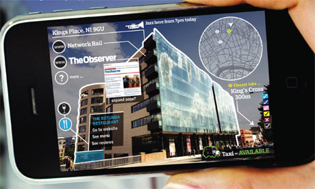
The i-phone fully utilized the touch screen in having an interface that had users playing with the screen with their fingers in different ways. This made the interface fun to interact with but it was logical too; stroke this way and the screen moves that way.
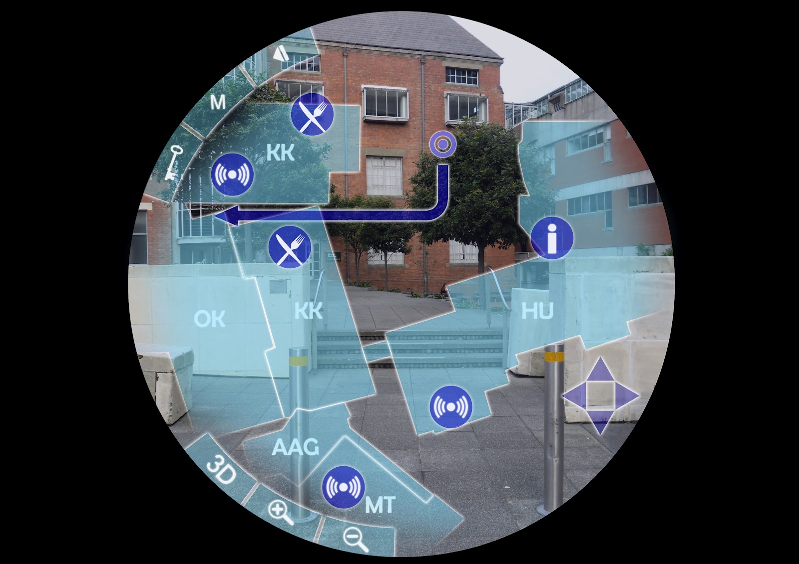
The consistency of style in this interface connects all the screens together, despite the significant difference in layout of each. This is achieved by the colour scheme and transparency of the icons and the background imagery.
Although this particular interface is a bit busy the colour scheme works rather well. The balance of colour is well done to show importance and to link everything on-screen.
All the interfaces so far have been rigidly structured but this one shows how it can be achieved with a more chaotic arrangement and still work. The transparency is key in allowing so many things on-screen in this manner, otherwise icons would be lost.

Saturday, 25 August 2012

First Steps

Yesterday we did an exercise to explore how many ways there are to direct someone to a specific location. We had written instructions, navigational drawings and maps, all trying to accomplish the same thing. The written instructions were easy enough to follow if they were well written but gave the least reassurance if you were on the right track or not. The other two types were visually based and harder to interpret but once we understood what was going on they made it easy to establish if we were in the correct area as we could visually compare our surrounding to the drawing.
Combining these ideas was the process we used to begin brainstorming for our navigation system. It sparked different ideas, like a system that recognises landmarks and generates directions accordingly, or having a camera-based interface that applies its instructions to what is visible through the camera.